Scandinavian Airlines
Booking flow redesign
As part of the Digital & IT design team at SAS, I contributed to the complete redesign of the airline’s booking flow — the heart of its digital business. The challenge was to modernize the experience, improve conversion, and introduce personalization while keeping the process simple and reliable for millions of travelers.
About the project
01
The booking flow is the core revenue engine of SAS — where over 60 % of all digital transactions occur. Even minor usability issues can have a major business impact.
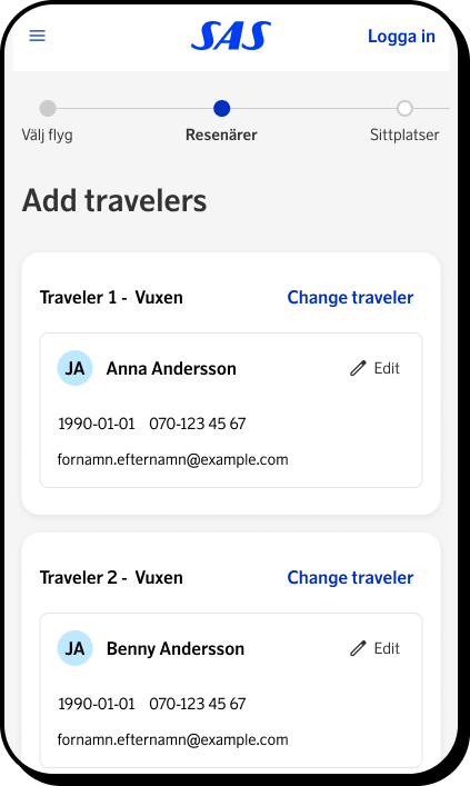
Working within the Digital & IT department, our goal was to design a new flow from the ground up as part of the broader website relaunch. I was one of four designers responsible for redefining the end-to-end booking experience: taking the best aspects of the legacy system, introducing flexible new features, and ensuring a fast, seamless structure for customers across devices.
Design process
02
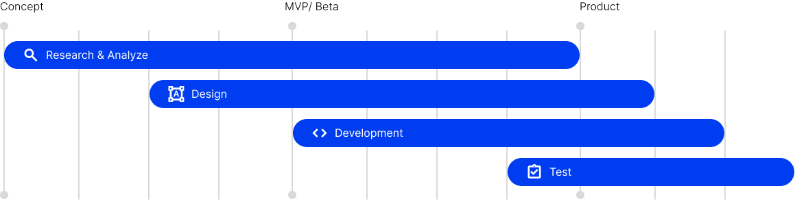
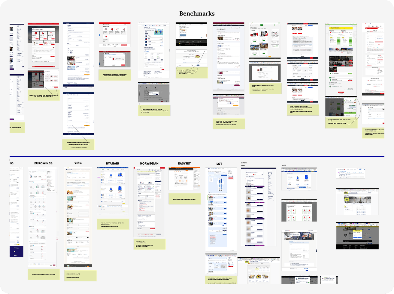
We started by mapping the existing journey, benchmarking against competitors, and identifying friction points in each step of the current flow.
Through workshops, user testing, and stakeholder sessions, we gathered insights that helped us define new user scenarios and requirements. These informed early wireframes, prototypes, and a modular architecture that could adapt to both app and web.
Challenge
The Problem
The previous system was highly fragmented and inconsistent across platforms. Managing multiple fare types, loyalty features, and ancillary services (like seat selection or baggage) made the experience confusing for users.
Our challenge was to simplify this complexity — creating a unified, predictable flow that still allowed for flexibility, upsell opportunities, and personalization
The Solution
Users prefer the app over the website, as it offers a simpler and more structured way to book and manage flights, with personalised features that make traveling easy and upsell ancillaries easier for stakeholders.
Clear.
Data based.
Personalised.

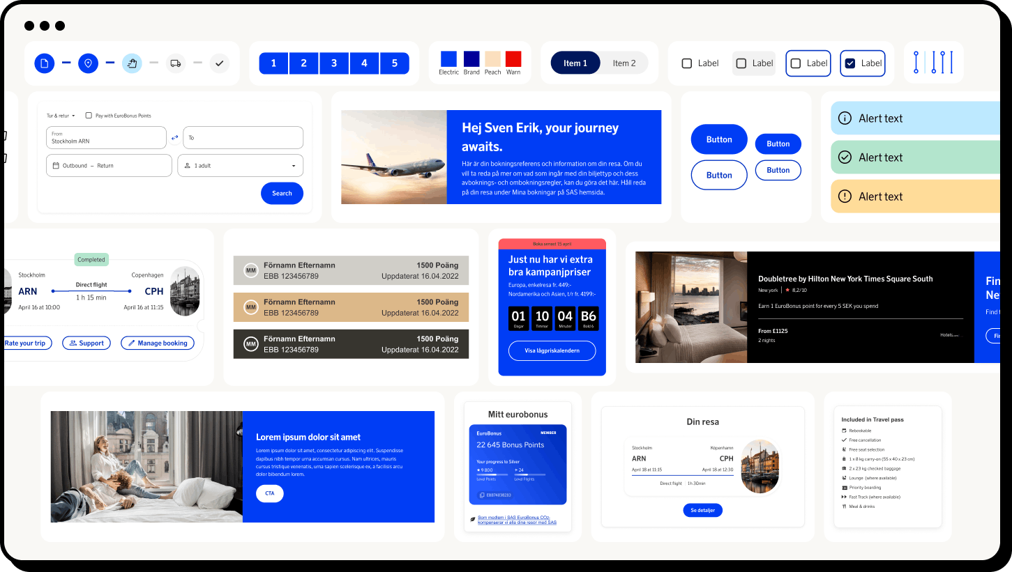
Blueprint Design System
03
In parallel with the booking-flow redesign, our team developed the SAS Blueprint Design System — a shared library of components, tokens, and patterns built to ensure consistency across all digital touchpoints.
I contributed to defining core UI components, interactive states, and documentation standards. The system now enables faster prototyping and higher design quality while keeping accessibility and brand expression aligned.
Navigation and Cart
04
One of the key improvements was introducing a unified navigation pattern and persistent cart across all booking steps.
This allows travelers to review and adjust their journey without losing context or starting over — a simple change that significantly reduced friction and improved completion rates in testing.
Choose your journey
05
The new booking flow introduces smarter defaults, clearer hierarchy, and dynamic personalization.
Travelers can now select, compare, and customize flights more intuitively — with real-time pricing and contextual guidance that adapts to their choices.
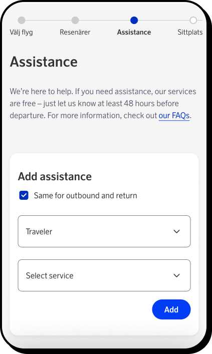
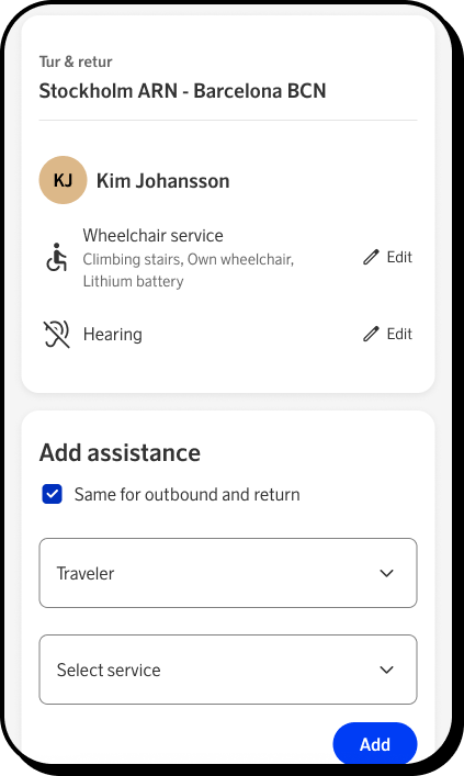
Travellers and accessibility
06
Accessibility and inclusivity were central to the redesign. We ensured that all core interactions — from passenger selection to payment — meet WCAG 2.1 AA standards.
Simplified input fields, high-contrast color modes, and better screen-reader support make the experience easier for everyone, regardless of device or ability.
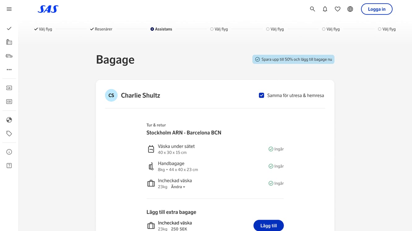
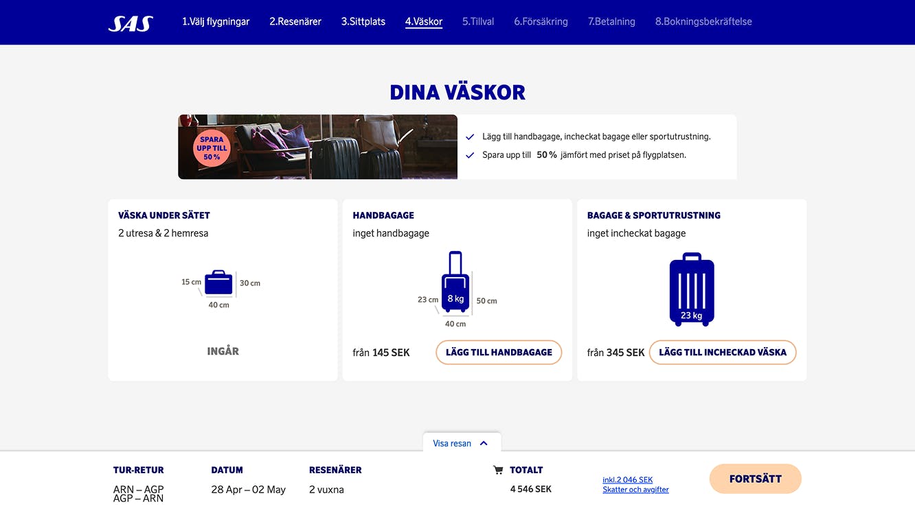
Baggage
07
During user testing, the baggage step quickly emerged as one of the most confusing parts of the old booking flow. Travelers struggled to understand which bags were already included in their ticket type, which benefits came from their loyalty tier, and how to add or modify extra luggage. Many also didn’t realize they could convert a checked bag into sports equipment. This is an important detail for travelers bringing skis, bikes, or other oversized gear.
To solve this, we began by mapping all possible baggage scenarios and identifying overlapping rules between fare types and loyalty levels. From there, we redesigned the interface to make each traveler’s baggage visible and clearly labeled by default. Accordion panels let users expand to add, remove, or modify luggage, while special equipment options are grouped intuitively within the same context.
The result is a step that feels transparent and flexible. Travelers can now see at a glance what’s included and what’s extra, adjust bags according to their trip, and avoid the uncertainty that previously caused frustration and booking errors.
Seats
08
Seat selection continues to be one of the most common pain points for both airlines and travelers. During research, we noticed users repeatedly asking the same questions: Which seats can I actually choose? How much legroom do they have? What features are included? Which seats cost extra and how much? These uncertainties often led to hesitation, frustration, or missed seat selections altogether.
To address this, we focused on bringing clarity and guidance to the experience. We redesigned the seat map to make availability, pricing, and seat features instantly visible through clear color coding and tooltips. Users are now guided step-by-step through each leg of their journey, ensuring they don’t accidentally skip a segment or overlook a connecting flight.
The new design transforms what used to be a stressful step into a smooth and transparent process. Travelers can make confident, informed choices about their seats. This reduces errors and creates a more consistent, reassuring booking experience overall.
Travel extras
09
The travel extras step is one of the most complex parts of the booking flow—both for users and for the business. It’s where travelers can personalize their journey even further, adding everything from in-flight meals and lounge access to fast track, biofuel contributions, or traveling with pets. For the business, this step also plays a key role in driving ancillary revenue through upselling.
During our discovery phase, we realized that the complexity came from variation: available extras depend on the traveler’s ticket type, loyalty level, and even the regions their flights operate in. Certain meal options are exclusive to long-haul flights, while lounge access depends on the availability at specific airports. This meant we needed to design a system that was dynamic, personalized, and context-aware.
We introduced a tiered approach: quick-add recommendations based on personal data (such as membership tier or previous purchases) allow users to add popular extras instantly. For those who want deeper control, an expanded view reveals all available add-ons. To reduce friction, we also added the ability to apply selected extras across all flight legs with one tap—simplifying the process for travelers while increasing upsell opportunities for the business.
The result is a more intelligent, guided experience that feels personalized rather than overwhelming—helping travelers build the journey they want with confidence and ease.
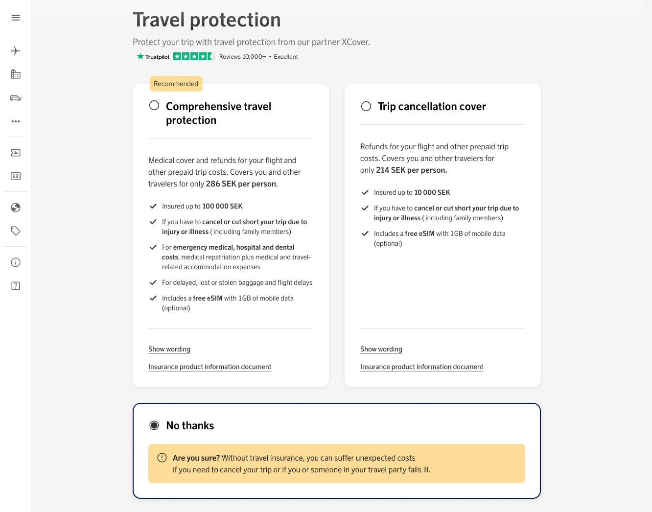
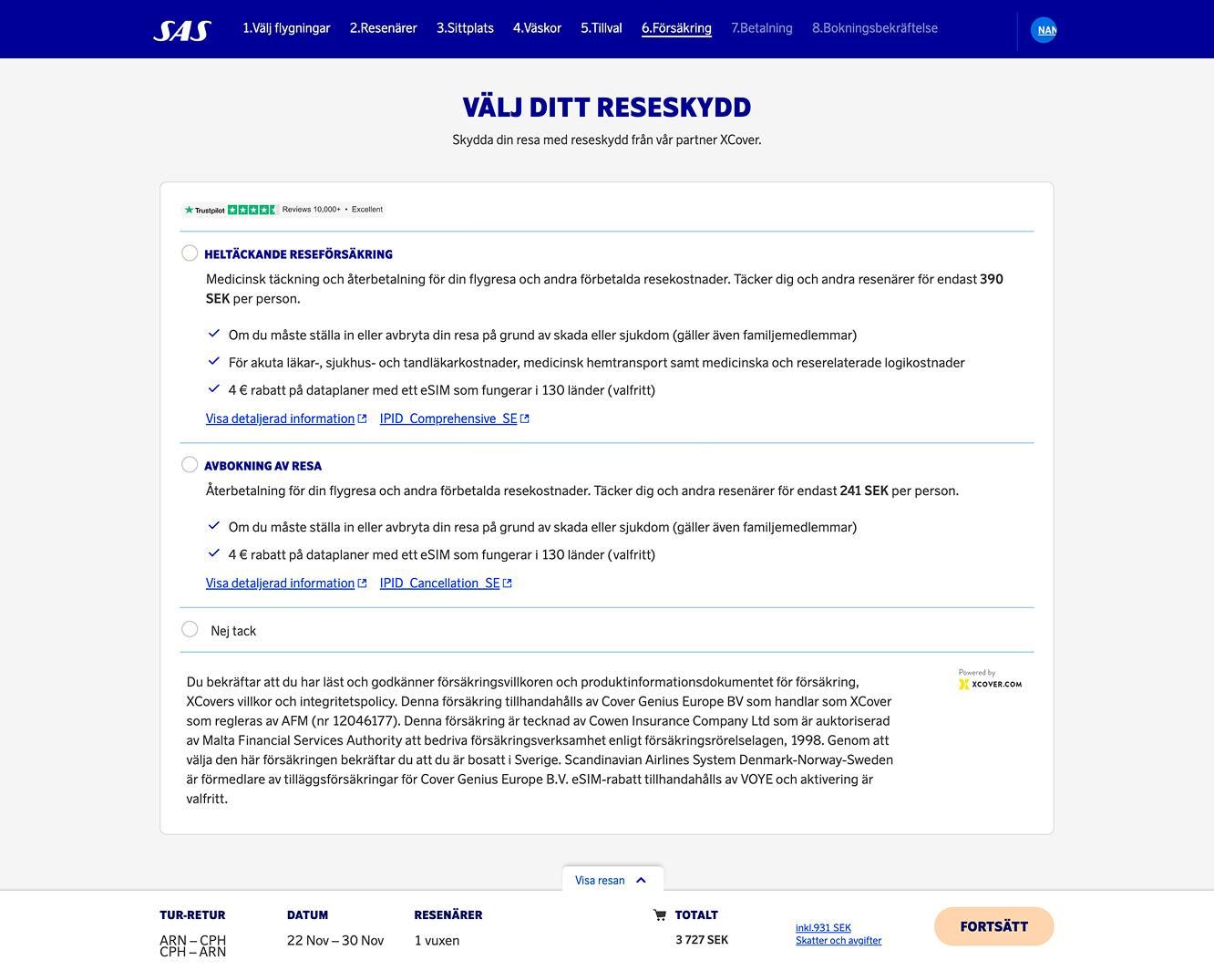
Insurance
10
Unlike other steps in the booking flow, the insurance step required minimal changes to its core experience. Over several years, the existing flow had been extensively tested and consistently performed well, giving the team strong confidence in its usability and conversion rate.
Our focus therefore shifted from rethinking the UX to refining the UI. We updated the interface to align with the new Blueprint Design System, ensuring visual consistency, accessibility, and responsiveness across all platforms. The refreshed design not only integrates seamlessly into the new booking flow but also provides a cleaner, more trustworthy presentation of insurance options—reinforcing user confidence at a crucial decision point in the journey.