Scandinavian Airlines
Blueprint Design System
By the end of 2024, the Digital and IT team at SAS embarked on a major initiative — designing an entirely new website from the ground up. The goal was to reimagine the user experience, introduce new features, bring deeper personalization, and ensure a seamless journey across all digital touchpoints, from the mobile app to the website.
At the core of this transformation was the SAS Blueprint Design System — built from scratch in parallel with the new website to establish a unified, scalable design foundation. As part of a ten-member multidisciplinary team, I played a key role in shaping and developing this system. Together, we created thousands of reusable components and patterns that now define a consistent and accessible user interface across the SAS digital ecosystem.
Why a design system?
A design system streamlines the way teams build and scale digital products. It brings structure, consistency, and clarity to your brand by combining reusable components, principles, and guidelines into one cohesive foundation.
With a strong design system, your team can move faster, communicate better, and deliver seamless user experiences — all while strengthening brand identity and reducing inefficiencies.

Atomic Design
Atomic Design is a methodology for creating design systems by breaking interfaces into smaller, reusable parts.

Atoms are the foundational building blocks of all interfaces.

Molecules are simple combinations of atoms working together as a unit.

Organisms are more complex components composed of multiple molecules (and atoms).
Colors
The color palette is inspired by the natural beauty of the sky across the day—from the soft glow of dawn to the infinite calm of night. Each tone evokes an emotion and a moment in the journey, supporting a brand experience that feels expansive, elevated, and human.
Primary colors
The energetic and adventurous part of our brand is driven by the Electric Blue, whilst the SAS legacy and craft is carried by the Heritage Blue and a set of more muted and neutral colors.
New Brand
#003DF5
Heritage Brand
#000099
Background Mist Grey
#F5F5F5
Secondary colors
Midnight Black and White are our foundations and create contrast with our Electric Blue. Mist Grey, Sky Blue and Sunrise Peach are used only as backgrounds and alongside Electric Blue for extra warmth and depth in specific instances. Horizon Red is used as an offer-related signal color and should be used very sparingly.
Accents
Coral
Coral.90
#FFEBEB
Coral.70
#FF8985
Coral.60
#FF5852
Coral.40
#EB0800
Coral.20
#850500
Peach
Peach.90
#FEF7F0
Peach.80
#FCDEC0
Peach.60
#F7AA5E
Peach.40
#E57A0B
Peach.20
#834606
Neutrals
Gray
White
#FFFFFF
Gray.90
#E6E6E6
Gray.70
#B2B2B2
Gray.50
#808080
Gray.30
#4D4D4D
Black
#000000
Gray Warm
Gray-warm.90
#F0EFEA
Gray-warm.70
#C4C0B0
Gray-warm.50
#999175
Gray-warm.30
#615B48
Gray-warm.10
#26241C
Functional
Green
Green.90
#D9F2E6
Green.70
#8DD8B4
Green.50
#41BE82
Green.30
#277241
Green.10
#0D261A
Red
Red.90
#F3D8D8
Red.70
#DC8989
Red.50
#C43B3B
Red.30
#762323
Red.10
#270C0C
Yellow
Yellow.90
#FFEECC
Yellow.70
#FFCB66
Yellow.50
#FFA800
Yellow.30
#996500
Yellow.20
#664300
Product
Bio
Bio.90
#D6EBE2
Bio.70
#92C9B1
Bio.50
#51A480
Bio.40
#408265
Bio.30
#2F604B
Gold
Gold.90
#F3E7D8
Gold.70
#DCB889
Gold.50
#C4893B
Gold.30
#765223
Gold.10
#271B0C
Silver
Silver.90
#E7E6E3
Silver.80
#D0CEC8
Silver.60
#A19D91
Silver.40
#6E6A5E
Silver.20
#37352F
Buttons
Buttons are essential interactive elements that guide users through key actions in an interface. They come in different styles, sizes, and states to adapt to a variety of use cases while maintaining consistency, clarity, and accessibility across the product.
Small
Medium
Large
Icon
Variants
| State | Solid | Outline | Text | Right Icon | Left Icon |
|---|---|---|---|---|---|
| Default | |||||
| Hover | |||||
| Pressed | |||||
| Disabled |
Examples
Text Fields
Text fields let users input information into an interface. They are commonly used in forms, settings, and dialogs. A well-designed text field offers clear affordance, supports efficient data entry, and ensures accessibility across devices and screen sizes.
Text input sizing
Text input
Default
Hover
Focused
Typing
Input field error message
Filled
Disabled
Dropdowns
Actions
Option single
Option multi
States
Default
Multi select option
Hover
Multi select option
Focused
Multi select option
Pressed
Multi select option
Selections
Selections like radio buttons, checkboxes and switches allow users to control different options, settings and situations.
Toggle Switch
Off
On
Hover
Pressed
Checkbox
Default
Hover
Focused
Active
Radio buttons
Default
Hover
Focused
Toggle state
Counter
Navigation
Provides a set of actions that enable users to navigate between pages within an app or a website to achieve their task
Tabs
Item 1
Item 2
Item 3
Item 4
Default
Item 1
Item 2
Hover
Item 1
Item 2
Focused
Item 1
Item 2
Breadcrumbs
Level 1
/
Level 2
/
Current
Default
Level 1
Hover
Level 1
Pressed
Level 1
Focus
Level 1
Pagination
Chip Input
Default
Input
Hover
Input
Pressed
Input
Focus
Input
Disabled
Input
Toggle Chip
Selected?
No
Yes
Default
Chip
Chip
Hover
Chip
Chip
Pressed
Chip
Chip
Focused
Chip
Chip
Disabled
Chip
Chip
Stepper
Välj flyg
Resenärer
Sittplatser
Tillval
Försäkring
Betalning
Default
Välj flyg
Completed
Välj flyg
Active
Välj flyg
Global Navigation
Firstname
22 645 p
Notifications
Notifications communicate important information to users in real time. They provide feedback about actions, updates, or system status, helping users stay informed and engaged. Whether it’s confirming success, highlighting errors, or drawing attention to new events, notifications ensure a responsive and user-friendly experience.
Alert Notifications
Alert text
Alert text
Alert text
Alert text
Alert Variations
Some reports could not be sent.
Example text
Some reports could not be sent.
Alert text
Alert text
Alert text

Avatars
Avatars visually represent users across digital products and platforms. They can display initials, icons, or profile images, helping personalize the experience and improve recognition. Avatars are commonly used in messaging apps, dashboards, and social interfaces. Though small in size, they play a key role in user identity and interaction.
Avatars Membership Levels
Avatar Groups & Status
Group
MM
MM
MM
+4
Status
MM
MM
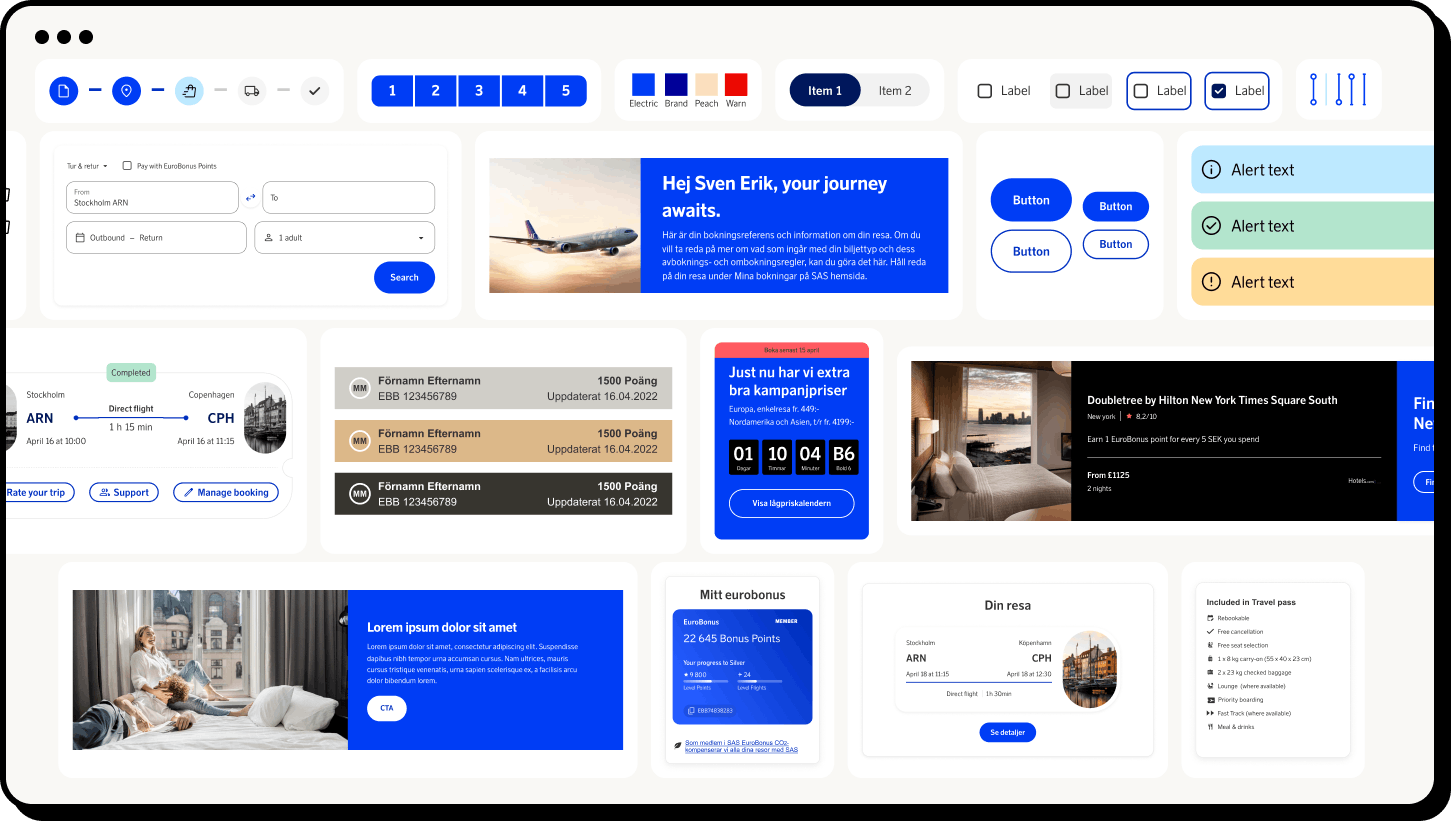
Components in use
See how the components are used in the new SAS web application.